- very inefficient lasers
- usless admor
- usless Frl
- no engines modules
- no shields
- usless storages
- bad placement (storages in left & right)
- usless ion
- no enegry to (back & left) thust
- no FE
your Superlaser 2.0 is just bigger vesion of it
this designs are very bad
Your Ion Prism Ships?
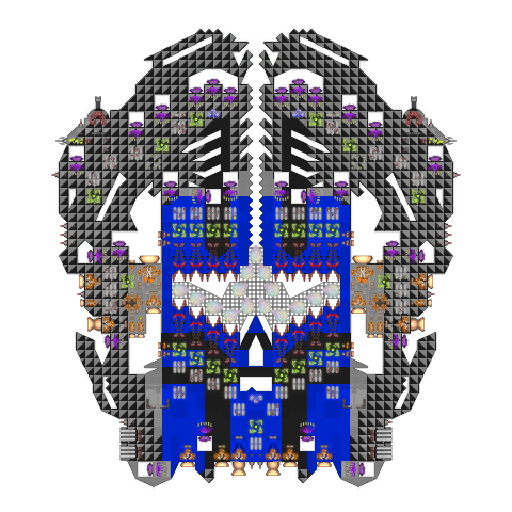
Anything wrong with this one? (I didn't do the ions, it was a collab)

why so anful paint really plis change this piant buring my eyes
damkiller That's probably the intention... Can't shoot what you can't look at.
I can't tell what is wrong with this ship when I can't look on
the ship
- Edited
damkiller i will tell you i have sun glasses he has 16 ions some of them will be ineffective (intentional game desing). seconly the shield at the front are useless because they dont get past the armor. if it is attackt from the side the intire thing will explode like a firecracker and lastly IIIIM BLIIIIIIIIIIIIIIIIIIIIIIIIIIIND.
edit: on top of the control room there is only one triangle on the left side and none on the right. my ocd is killing me
Roasted
First of, the ion array on his design follows the formula and is as effective as it gets.
Not having the shields cover the outer layer(s) of armor makes for a good counter against EB-focused builds. Protecting the sides is rather unnecessary as the ship is only supposed to show its front but might be a good idea against enemies using flakers, in which case that much is enough.
However, the triangle thingy really is not mirrored and he did some rather questionable stuff regarding reactor placement and maneuverability.
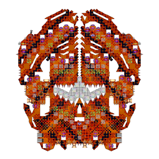
I does very hard operation Idk how but removed paint and changed to way better

damkiller Ironic
I'm gonna be honest, the original paint wasn't exactly what one would call aesthetically pleasing, but this one may be even worse. It looks like a mix of a save error and roughly ten liters of some strong alcohol mixed in with some rally sripes or something. Oh, and the orange doesn't really fit.
