This is a mod designed with the competitive community in mind. It makes a bunch of changes, additions, and removals to aspects of the base game with the goal of making everything much easier to see; the less time you have to spend analyzing things, the more time you have to strategize and pilot. Before getting into its features, here are a couple important things to note:
- This mod is completely and totally client-side, which means it is completely multiplayer-friendly. Anyone with this mod enabled can join anyone without the mod enabled without issues.
- As of V1.1.0, I've set up the mod so that it's extremely easy to toggle features at will. There's no way to do this ingame, but I've added a quick tutorial within the mod.txt on how to toggle features (which I've made as simple as adding two characters per feature you want to disable). If you don't like a specific feature, you can simply disable it from the mod.txt even if you don't know how to code, and everything should still work properly.
Alright, on to the current list of features! This is just a quick summary of each "module", check the changelog for a better description of each mechanic:
BlackBackgrounds - Turns all backgrounds blackNoPlanets - Removes all planetsBusNukes - Turns nukes into bussesDistinguishableArmor - Adjusts 1x1 and 1x2 armor's textures to add a borderVisibleMines - Makes mines continuously display their activation range, also making them easier to see from a distanceAntiVanta - Renders invalidly dark paint as a gray checkerboardUltimateIonVisibility - Among many other things, makes ions progressively change color as they get strongerIonCoreVisibility - Drastically reduces ions' width and removes prisms' glow effect (disabled by default). Best used in combination with UltimateIonVisibility.NoTBObfuscation - Removes tractor beams' warp effectVisibleCRs - Overhauls control rooms' textures to (hopefully) be easier to see
V1.1.1 - Major Hotfix and QoL:
https://www.mediafire.com/file/fdog0ha6bg9p9gf/Competitive_Graphics_V1.1.1.zip/file
- Fixed "Visible Mines" causing multiplayer incompatibility (uh, whoops). As an unfortunate side-effect I had to remove mines' spinning lights, though I don't think that will be a huge deal considering the range indication is basically an upgrade to that. The only other real option is to add it as a static texture, which doesn't look as good and needs to spin.
- Tweaked "Anti-Vantablack" to theoretically intercept more exotic forms of invalid paint. I can't easily test this myself, but afaik it should work. Please let me know if there's still a way around it.
- Added a new module (disabled by default) that removes prisms' glowing effect entirely, and further narrows ions' width. Designed for working with extremely complex ion cores.
- Minified anti-vantablack's shader (curse you HLSL function documentation!) and added more comments to stuff.
V1.1.0 - The update nobody knew they needed:
https://www.mediafire.com/file/ap3sgyoye2hauo4/Competitive_Graphics_V1.1.0.zip/file
- To cut to the chase, almost every single aspect of the mod's inner workings got overhauled so many times I basically ended up rewriting most of it from scratch. The mod's file size and length was reduced/minified, and three entire support files were completely removed removed. The code also got updated/upgraded/minified in too many ways to really list without getting boring. In short, basically everything got polished and honestly I might've put way too much effort into changes almost nobody will care about. Also I changed the mod's name to make its purpose less confusing, not really sure why I used "enhanced" over "competitive".
- Easy feature toggling! I completely restructured the mod.txt so that you can comment out a single line to remove an entire feature, and all of the features are listed right next to each other. This means if you don't like/want part of the mod, you can simply open the mod.txt and disable it with ease. I even wrote a small tutorial with examples on how to toggle stuff, so I don't want to see anyone complaining about not knowing how (unless you don't even know how to open the mod.txt or something crazy like that).
- Alright, time for the actual useful stuff. To start out with, control rooms are theoretically a lot more more visible now! I've noticed that even though reactors are always super easy to see, CRs can blend into certain paint schemes much more since their windows are so small. To compensate, I basically doubled the windows' size and colored them more like a bright aquamarine. They sometimes appear similarly to FTL drives, but that shouldn't be an issue in multiplayer anyway. This is the change I'm the least confident in, if you have any suggestions on how I could better make CRs visible, please let me know!
- On a similar note, I've noticed at times that it's very hard to actually target reactors or other parts next to/underneath TBs because of how ridiculous the distortion level can become; the part you see and the actual part's location can be up to meters apart. To counter this, I simply removed TBs' warp effect. This basically has no effect if fancy particles/VFX are already disabled, but if they're enabled life will be a lot easier. Side-note, for some reason TBs become very opaque if fancy particles are disabled, but after a brief look I can't really figure out why. If it's a major issue, I can upload a hotfix or something, but honestly fancy particles take so little power anyway I don't think it'll be a problem for most players.
- By popular demand, mines are now way easier to see! If fancy particles are enabled, mines now continuously display their activation ring, which both tells you exactly how close you can get, and drastically increases how large they appear zoomed out, making minefields infinitely easier to see. In the process of making this I also noticed that for some reason mines' activation ring and activation VFX don't actually line up, so I fixed that along the way. This effect may have a small performance impact on weaker computers. Note: before anyone asks, team-based mine colors is impossible. Believe me, I tried, and I even asked Walt who confirmed there's no way to do it. Friend/foe is also impossible without at minimum breaking MP-compatibility, which is kinda the entire point of this mod. Sorry, I know a lot of people wanted it, but there's nothing I can do. Also worth noting that extreme framerate lag may cause the effect to temporarily stutter or disappear similarly to projectile glow particles, and it doesn't appear when the game is paused (though existing instances of the effect won't be removed).
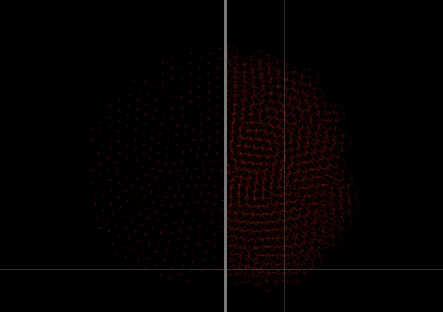
- One problem with the mod some people have reported is that since backgrounds are pitch black, hacked pitch-black (or "vantablack") paint makes things extremely hard to see. To counter this, I wrote an entire shader system to detect and graphically (not actually) remove vantablack paint automatically. Any paint colors that are darker than should be possible will instead be rendered as as a slight gray checkerboard pattern. I originally wanted to use a missing texture texture, but it turns out black and bright magenta don't really help part visibility that much. Note: Due to the modified shader using screen-relative coordinates instead of ship-relative, the effect slightly breaks when viewing vantablack in the picture-in-picture. Nothing major, it's just stretched really far horizontally. I'm looking for a way to fix this, though no promises for the time being.
- Oh boy, this easily took 75%+ of this update's time and effort. Ions graphics got completely overhauled in a ton of different ways. Ions are now thinner and don't increase in width, which makes crossing ions much easier to interpret. Now, you're probably thinking, "But Redstone, without width how do I know how strong beams are just by looking at them?". Well, do I have the effect for you: Ions now change color the stronger they are!! Each time you efficiently combine ions (2:1), the color of the output beam will advance from red to orange, orange to yellow, etc, all the way until it wraps back around to red at 256 evenly-merged inputs, at which point you should probably get the idea it's strong. Additionally, this allows you to actually visualize ions' lesser-known falloff effects in realtime, as ions with more falloff will partially recede from their original color back down to the previous level. This feature is fantastic both for judging ions' strength at a glance, and for designing ion cores since it allows you see exactly how they're combining instead of just seeing a giant red blob. Now, unfortunately this effect comes at a small cost; I've basically had to recolor all of ions' and prisms' associated particle effects to white. Attempting to apply this effect to prisms' glow is simply impossible, and attempting to apply it to particles registers, but the color is assigned on a screen-wide basis instead of a per-particle basis, meaning the particles' color is effectively a random selection of different ions' colors on the screen. It's ugly, glitchy, and because of the way modding is currently set up there's unfortunately nothing I can do to fix it. To compensate, I've adjusted some of those particles' transparency and layering to help them blend pretty seamlessly with the new effects, you should get used to it pretty quickly. Also in case anyone actually finds this, due to the way ions' intensity is handled, right around 2048 ions the intensity hits a cap I can't reasonably remove. Due to this, ion width being static, and part overkill basically making ions stronger than this have no additional effect, once you hit that point (which I might add is ridiculously hard to do) the ions simply turn white. Not a bug with the shader or anything, it's just dealing with a cap.


V1.0.0 - Original release:
http://www.mediafire.com/file/myn3hz8059ja7vf/Redstone%2527s_Enhanced_Graphics.zip/file
- All backgrounds are replaced with a featureless, black variant. This makes things much easier to see, especially zoomed out, since the background is both colorless and textureless. As a side-effect, it may marginally improve framerate on weaker systems. Note that to avoid potential mod conflicts this only has effect on newly-generated maps; loading an old save will still retain its original background(s).
- All planets are effectively removed. This, like the black backgrounds, makes things much easier to see, and as a side-effect drastically improves sector loading times for the client (this will only help in multiplayer if the client would have been the slowest player).
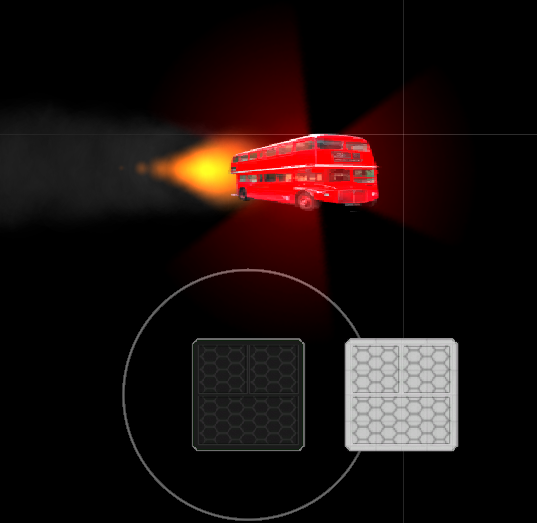
- Adds a small bounding box-like texture to 1X1 and 1X2 armor plates to make them really easy to tell apart. This applies to all layers, including blueprint mode.
- Replaces nukes' texture with the dreaded BUS. Yes, this is strictly necessary. I almost considered purposefully making it hard to remove.

