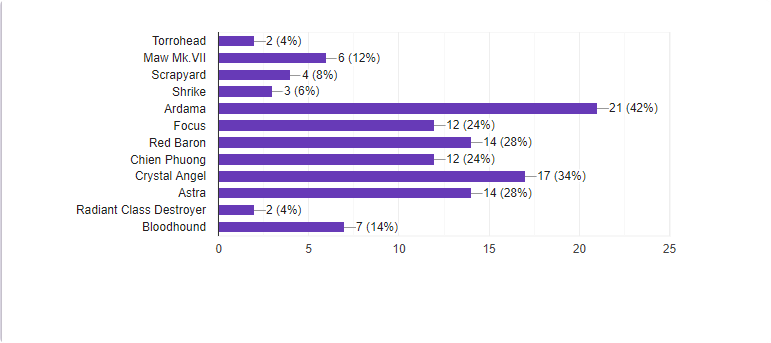
Thoughts -
The paintjob on Torrohead is too dark for my tastes, I feel it could use some more highlighting to offset all of the roof-boondongles things have. It's too dark to really make out anything against Imgur's black background.
Maw mk VII, while an interesting idea that's reasonably well executed, is too cartoon-y and simplified in comparison to cosmoteer's graphics. The railguns and engines contrast too much with the black. Maybe if the design was abstracted more it would work better.
Scrapyard - it seems built along the lines of the junker, but larger and with a more symmetric paintjob. I think a paintjob that orderly works against it's ramshackle constructions.
The Shrike has a simplistic shape and doesn't utilize the third color much. I like how the thrusters are given a sense of being recessed by the paintjob.
Ardama has a nice paintjob, utilizing strong contrast and working the the color palette of cosmoteer. The thrusters and ion prisms blend in. I like the repeated eye motif.
RedBaron is irking me because you can put spaces in ship names just fine! The railguns break up the paintjob. What would otherwise be an expanse of curves of red an black is interupted by straight lines of grey. If you look at Excelsis, the built in ship, you can see how it makes the railguns less glaring by having white higlights scattered about the ship. I think it would look better without the railguns.
Chien Phuong has a space in the name! The paintjob is nice, but... odd. having smooth transitions within but cutting off abruptly in some places. I admire building the entire design to look like a bird.
Crystal Angel blends design and decals to give it an insect-y feel. I like how the purple of the shield generators was used as an accent and it was armed with relatively color-neutral cannons instead of lasers, which would leave bright red boondongles on top of the ship. Also, the reactors go well with it. I feel it could use some more dark bluish-green in places, but otherwise good.
Astra, by Namek, is doomed to be blown up by Frieza. One of the smaller contestants, alongside the Shrike. Interesting design and nice use of diagonal lines. Nice use of open spaces, shields break up the lines a smidge.
Radiant Class Destroyer has an eye-searing paintjob by virtue of contrast. The frontal armor and rear sides bug me by being the only places to use thin lines instead of the tile + wide ones used elsewhere. The design is interesting in it's use of those scaffold-y thingimagijs that give it a secondary shape of sorts.
Bloodhound is red. Very red. The paintjob uses entirely shades of red. I like how it blends with the Ions. The design is interesting, and I think the two frontal tongs are the least interesting part of that. The lasar maw and side-spikes have interesting shapes while the nose is just kinda blobby with holes in it.
For my own entry...
... I forgot I was using modded decals, here's what it would've looked like, except with red paint in place of blue.
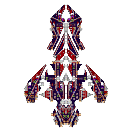
(Alternative name: Tastes Like Apple Pie)